- by J. Peter
TOP 5 Web Design Trends In 2020s
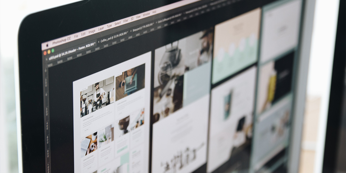
Having a cool and modern design for your website can be crucial for growing your business, no matter the size. A good design can help you increase sales, improve the quality of your customer support and even help you find business partners. Nobody likes outdated looking sites, like from 1998, so bare with us and you will see the 5 most trending website designs of year 2020. Who knows – you may even find one that suites your needs.
Almost every year web design trends change. Old styles and designs are being reinvented with many experimental and new techniques. Most of the old sites are being shelved as newer and sleeker versions of sites dominate the internet with unseen user interfaces and amazing responsive features.
In this post we are going to be covering the 5 (in our opinion) most trending website designs that can’t be ignored in 2020.
In this post we will cover:
1. Dark Mode
2. Design with 3D elements
3. White Space
4. Mini Animations
5. Minimalist style
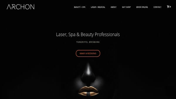
1. Dark Mode
Dark backgrounds make design elements stand out more, creating a higher contrast ratio with the use of other colors, but still improving visual ergonomics by reducing eye strain. – Dark Design Studio
Dark themes are better for OLED (An organic light-emitting diode) screens – saving power and extending screen lifespan. Dark mode conserves battery power, thereby enabling device usage for longer periods without charging. By using dark mode the screen glare is reduces thus minimizing flickering and blue light.
Sample: Archon
There are also some cons to dark mode:
- Dark themes are not always better for eye strain. In bright light conditions, the text appears washed out, increasing eye fatigue.
- Long pieces of content or text are challenging to read in dark mode.
There are some instances of dark mode being adapted in our recent history.
- November 2018 Google Confirms dark mode on Android saves battery life.
- 2018 – Youtube added optional dark theme
- June 2019 Apple announced dark mode availability on iOS13 and iPOD OS
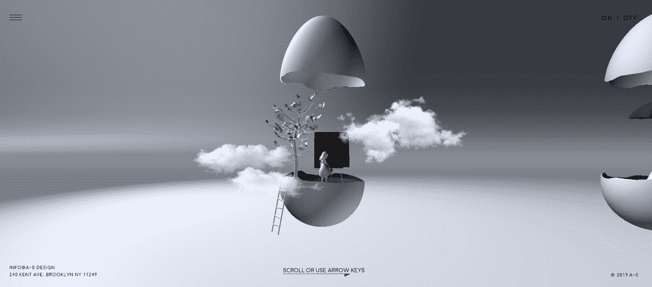
2. Design With 3D Elements
For a long time 3D objects and elements were only used in gaming and entertainment industry. Because of the rise of average device processing power, we have 3D objects emerging on regular websites both on desktop and mobile versions. By using 3D elements in web design you can add realism and interaction making design more appealing.
People have always liked 3D visuals but were held back by the price. Since technology is advancing with ever increasing speeds, in near future we will see without a doubt a rise in usage of 3D elements in everyday life not just webdesign, gaming and advertising.
As Pinch Studio explains the technology is now in a place where you can design in 3D without NASA-Tier equipment, opening the gates to more and more designers.
Sample: A-0 Design
Some websites use many 3D elements that some computers load slowly and therefore make for not the best user experience. The key is to find a balance and combine with responsive designs for the best effect.
If properly executed use of 3D elements in webdesign can dramatically improve user experience.
3. White Space
White space – many times being referred as negative space – is the part of a page (the space between all the elements) left unmarked and essentially empty, blank. Although it’s called white space it does not necessary has to be white , it can be shades of white, any solid color, blurred colors or combinations. Main goal is to separate elements from one another with space that is filled with essentially “nothing” referred as white space.
An example of amazing white space usage we all will recognize is used by google home page.
Sample: Google
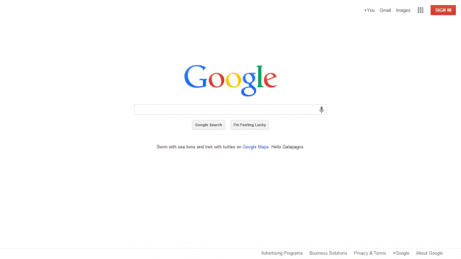
It can in fact increase content legibility. White space between and around paragraphs of text and images actually helps people understand what they are reading making overall experience better.
Highlit’s CTAs (call to action), using white space around buttons makes them stand out and separate them effectively from unrelated elements of the page. Helping people navigate easily.
Using white space design improves page print-ability, making it easier to prepare, design and print paper copies for essential articles or information for archiving purposes.
4. Mini Animations
Using different kinds of animated objects or animations gives a unique and aesthetic feel to the site. It can even make use of user interface easier by adding animation effect to actions such as slider actions “next” and “back” with use of keyboard arrows. Why easier? Well, because if you know that the page is going to turn when arrow key is being pressed for “next” then you expect it to work backwards too and if it does you instantly develop a sense of confidence and trust for website.
Mostly animations in webdesign are being used to compliment storytelling and for smooth navigation.
Older computers would probably prefer a static page to view, as all these animations use extra resources to display them and sometimes can make user experience unpleasant and maybe even make people not want to come back ever again, if browser keeps crashing or working really slow.
Sample: Smash Mallow
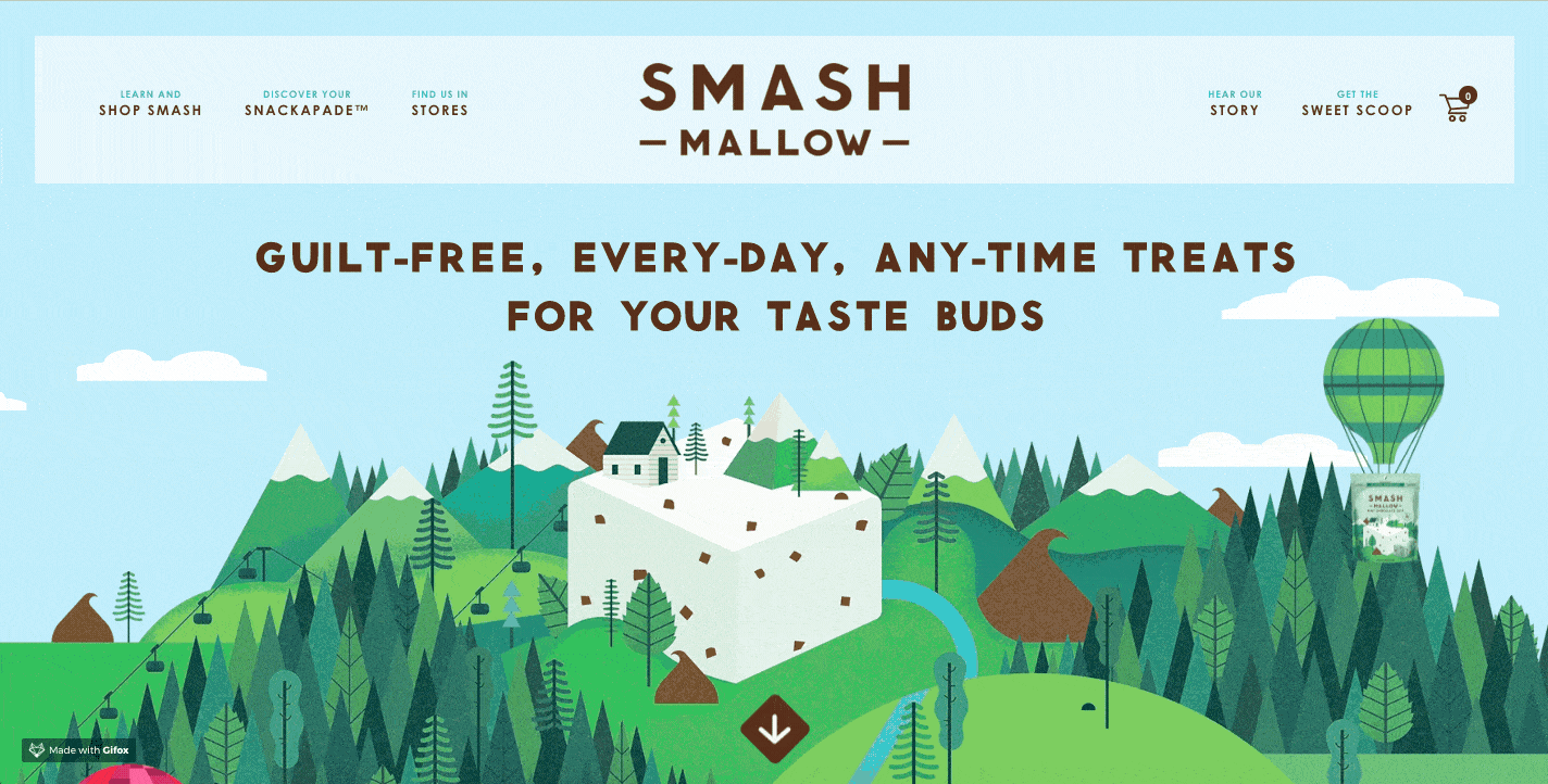
Since it’s the 21st century, most smartphones can handle simple animations. So if you are thinking about implementing any kind of simple animation effects on your site – go for it and don’t think twice.
5. Minimalist Style
“The art of less”
It focuses on space, simplicity and beautiful typography. It can be explained as simple in nature with only elements necessary for fulfilling a function. This kind of approach to design itself isn’t new at all, throughout the past you can find numerous instances such as Dutch movement ‘De Stijl’ – for “The Style” pushing simple and abstract ideas using lines, blocks, rectangles and primary colors.
Some of the most iconic traits of minimalist webdesign:
- User friendly interface
- Not many colors being used, usually no more than 3
- Beautiful Fonts
- No extra buttons and no excess details
Main mission for using minimalist style approach for webdesign is to simplify the interface by removing unnecessary elements.
Sample: Maer
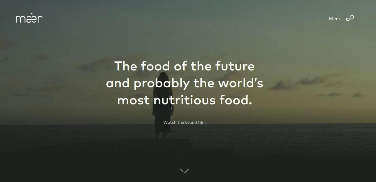
Websites with this design are easy to make responsive. They load considerably faster and have intuitive navigation that helps to deliver a smooth user experience. Although this design has many benefits, sometimes it gives users an unfinished feeling and sometimes can make someone wonder where their usual navigation is, making them spend unnecessary time to find them.
Conclusion
In conclusion, choosing the right design for your startup is crucial to creating a successful business. Depending on the nature of your startup, you may consider different design styles, such as minimalist, modern, vintage, or playful. A minimalist design can be great for a tech startup, while a vintage design may be more suitable for a clothing or furniture business.
A modern design can work well for a marketing or advertising agency, while a playful design can be perfect for a children’s toy or game company. Ultimately, it’s important to choose a design that aligns with your brand values and target audience, and that will effectively communicate your message to potential customers.
We hope this post gave you some clarity of ‘what is what’ and maybe you even found a type of design style you would like to apply to your following startup website.
Happy Designing & Thanks For Reading.
Must Read

Disclosure: Some of the links within this post are affiliate links of which I receive a small compensation from sales of certain items.